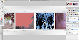
This is the first attempt of what the actual Cd looked like then I used that style of text I used on the other designs and it made it look more like a Cd image. I also used this rainbow tool which I used around the rim of the Cd to make it look shiny.
I pasted a cd template on to the cd panel and then edited the photo on the sun setting,


In this panel there will a information booklet and I changed the style of text for this as well I like this because The way I edited it the mixture of colours and it is not to over powering it is quite relaxing to focus on. I wanted the digipak to have calming colours inside and more bolder outstanding colours on the front cover.
Also this image I edited at college of Yasmin jumping in the air and the tree's I edited in the background I thought it looked effective for the front cover as for it is different, I gave the digipak the same style of text throughout and moved the title Feist In between Yasmin's hands in the air. Also the new change to the text means you can now read the title so much easier it stands out to buyers also.
Before

I was playing around with the tools and effects and I changed the effect of the text and it looked really nice and the font was more suitable for a digipak.


I have typed the track list out I thought red looked nice however I then began to change the numbers to the colour yellow and thought the text would look more presentable in yellow as well.
This is another image of the river that I edited, I have decided to use for the Inside left panel that will provide the buyers with an information booklet about the artist Feist.


No comments:
Post a Comment